Storefront component library
Existing storefront components, with their original appearance and behaviour. All prices below are demo data.
Product selection
The same SelectionRow used on product pages. Radio and checkbox choices share the original row style.
Purchase action
Extracted from the existing product page; width, colour, radius and disabled state are unchanged.
Demo only. Your cart has not changed.
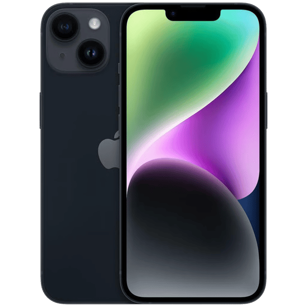
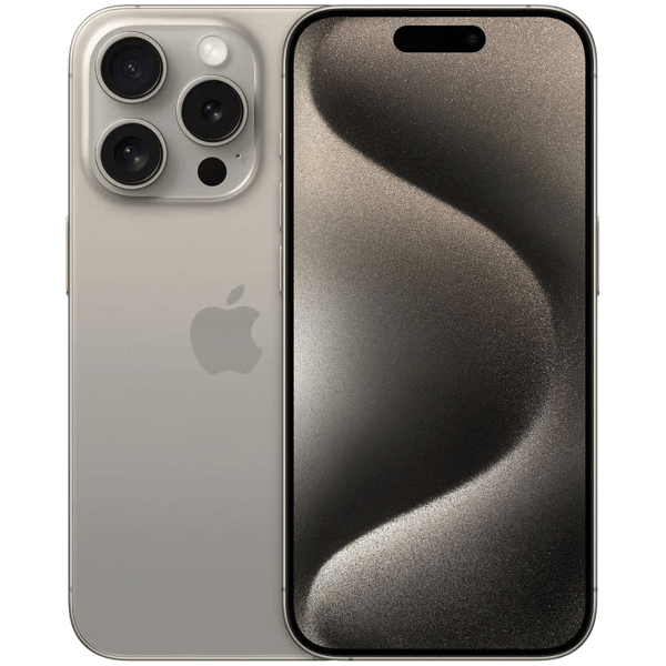
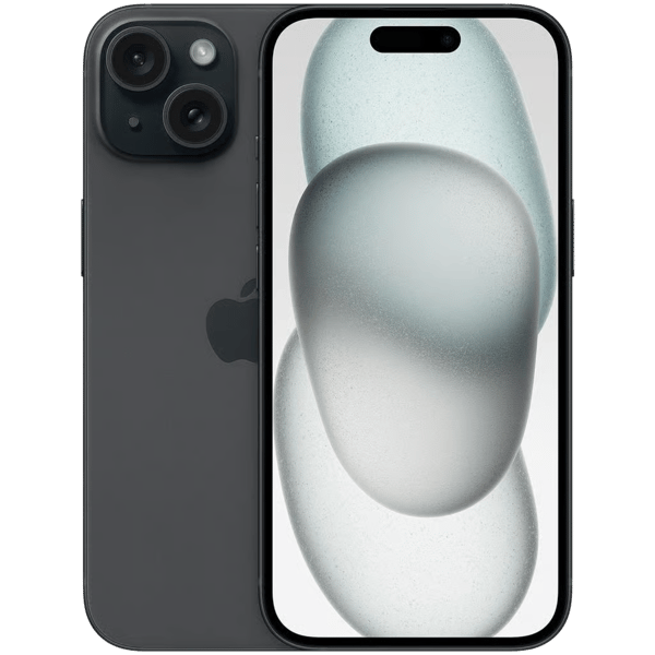
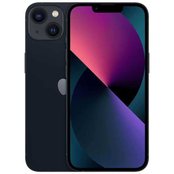
Product cards
Store search and this page render the same ProductCard, including capacity tags, colour swatches and prices.

Condition badges
Existing product condition badges.
Theme & typography
Shared brand, functional and neutral roles. Existing commerce components retain their established styling.
#1677FF#52C41A#FA8C16#F5222D#FFFFFF#F8F8F8#000000E0#000000A6#D9D9D9#0505050FOutfit · Section heading
DM Sans · Body copy, labels and supporting information.
Spacing: 4 / 8 / 16 / 24 / 32 px. Content width: 1200 px.Forms & validation
Native HTML controls, with dimensions based on the existing review form. No React hydration.
Feedback, badges & empty states
Use danger for errors or destructive actions, warning for attention, and success for completion.
A clear explanation and a relevant next action.
A clear explanation and a relevant next action.
A clear explanation and a relevant next action.
A clear explanation and a relevant next action.
No results yet
Try adjusting your filters.
Your demo is ready.
Skeletons & loading
Reuses the actual store skeleton grid, including the card geometry and responsive layout.
Dialogs & drawers
Native dialogs support Escape, focus return and a modal backdrop.